taking pictures of pearl jewellery

I totally agree, true colours are what the customers are holding in their hands at the end of the day. Especially if you sell pearls over the internet as we do, if the picture is promising something they are not you will loose the customers trust.
 
Thanks to you all, I am working on a white background with faithfull colors of pearls.
I am always featuring all sides of pearls, to show all specifications, not only the best one.
Will post some better photos when I will have improved the process.
 
Amanda, can you tell us about the white vs gray? No pressure (just WOW us), only if you have time. Or the early posters can chime in, if you feel like it?

Amanda, could you talk to us about the 'Gray Standard' and 'White Standard'? No pressure, just I haven't found the old post about them yet.


Sorry, only just saw both of these. I've not taken many pics of pearls, but have taken quite a lot of prehistoric flints and of small silver medaeival coins.

When you take photos with an automatic setting, the camera works out what speed etc is needed from the amount of light it detects. That means that if you take photograph of a polar bear on an ice cap in sunshine, they all look grey - because the camera uses an average setting, and that amount of light off white surfaces confuses it.

So if you take photographs of pearls on a white background, there is a risk that the pearls come out darker than they really are, because of the camera's taking into account lots of white.

There are two ways round this. One is to use a grey card, the other an average-ish background.

If you use a grey card, you meter your light off this. Then the light setting will be accurate for the amount of llight there actually is. Because the camera assumes the grey-card hue when measuring the light.

Or you can use a background which is approximately right.

The former is more accurate, and also a lot more hassle.

The picture below I took with a grey card to hand, because the pearls took up most of the screen and are pale. So I measured the light off the grey card, then took the photo:

IMG_0771.jpg
 
If you look at those pictures, you can see that the apparent shade of the pearls does in fact vary between them - they look a bit darker on the photo showing the clasp, for example.

I don't know exactly how they were taken. You could do it by metering the light and setting the exposure yourself. You could do it with a grey card, but my personal guess is that they use a lightbox. You'd need to ask them to be sure.

PP does have fantastic photos.
 
Thank Amanda,
I am not convinced by lightbox for pearls, this alter a lot the glow and texture of pearls.
Yes PP phoos are perfect and beyond.
 
they could use a "daylight" lightbox - that's what I had in mind. But you'd need to ask them, really.
 
Thank Amanda,
May I put under criticism the photo below.
I have been working on getting the background as white and clean as possible and pearls as close to reality, though background is still not white enough ...
Thanks for all comments
 

Attachments

  • light-test-pearls.jpg
    light-test-pearls.jpg
    11.3 KB · Views: 48
Anna,

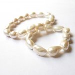
The photo looks very realistic to me. I can see the texture of the pearls, variation in color, over all creamy appearance. I completely agree, getting them to look like they really are is so difficult. I do use a light box, because we have so many gray and rainy days here. My large living room corner windows that face north and east, bring out the glow in the pearls, but grids in the windows cast a shadow, so I cannot photograph there.

This is the set up I use, atop storage shelves, so I can stand when taking photos. And leave it set up all the time, which is key for me.
IMGP2530.jpg

There is another adjustable arm on the pole lamp you see on the right These are supposed to be "true color" fluorescent bulbs. Currently I am using poster paper or handmade paper in white for background, always looking for something better. I can adjust the lights for best diffusion.

Almost always there are hanks and strands of pearls laying around in my living room, primarily freshwaters, draped over chairs, atop the tables, on the foot stool, and they show off their changeable colors at different times of the day, surprising even me.

I do crop a few of my photos now, but don't photoshop. My camera is a small Pentax 7.0megapixels pocket size I can hold in one hand and snap. It has 2 macro settings, which I use all the time. Probably due for a new camera one of these days!

Thanks to Everyone for sharing!
 
Last edited:
I read somewhere that one way of taking pictures of pearls is to put then in a shallow dish with water. Water is diffusing light making pearls look more natural on the picture. I tried it and liked the result.
All the pictures below are of the submerged pearls ...Only problem I had was getting rid of the bubbles of air. You still can see some ....
No photoshop. Just cropping.
IMG_0741.jpgIMG_0790.jpgIMG_0776.jpgIMG_0729.jpgIMG_0734.jpg
 
Thank you Pattye and Ivona,
That is top useful
I will try next , some shots in water, and grey reference for white balance, interesting.
When one needs a photo in situation, there is no such problems, we can put pearls on any background color and style, but when it is question to make a wall of items for sale, the thumbnails are featured into small squares/rectangles and it is necessary to have a pure clean white background such as here :

http://www.net-a-porter.com/Shop/Accessories/Jewelry

At that moment, pearls are the most difficult to shot, for balancing the white background with the most accurate glow and texture of pearls.

Light box allows the white background but the most beautiful pearl glow (for me) is real daylight. Maybe I don't have the right lightbox and the one you show Pattye looks better, or a "daylight" whitebox as Amanda said, but mine is still NOK for pearl (while "nearly" Ok for other material, see photo of lightbox with a white bakground, the pearl in the middle is very circled, so light reflection is easier to shot).

Other walls of pearls with perfect white balance :

http://www.pearlparadise.com/White-F...Pearls260.aspx

New experiments to come...
 

Attachments

  • P11205458-night-blue-gold-murano-20.jpg
    P11205458-night-blue-gold-murano-20.jpg
    12.9 KB · Views: 52
Last edited by a moderator:
These are a few photos I took earlier, in daylight and not strong sunlight.

1. These are metallic-lustre pink pearls, very nice indeed. The reflection on these isn't from a light, or flash, they just grab any available light and throw it backatcha. I used a grey card to measure the light, and the colour is true to life.

IMG_0822.jpg

2. These are also metered off a grey card, and the colour's perfectly true to life:

IMG_0815.jpg

this one I took using the automatic light setting. As you can see, the white background confused the camera - it looks grey in this:

IMG_0820.jpg

These too are taken with the automatic setting, and the white looks grey-ish:

IMG_0819.jpg

These are high lustre white baroque pearls, taken by metering the light manually:

IMG_0812.jpg
 
Great tips Amanda, thanks,
I started using a grey card and still have to improve my settings, and the result is blueish rather than yellowish, which I do prefer.
The white pearls are the hardest to capture and your last photo shows a great result with perfect shades or cream white and pink white
 
This is marvelous, very helpful!!! Thanks for taking the time to explain and demonstrate, Amanda. Do you have time for a short few questions?
1) Is a gray card something standard you buy at a photo shop?
2) Did you photograph the pearls on a white paper towel after metering with a gray card? and
3) should we change the advice in the short list of tips, to "photograph on a light gray background", since occasional photographers might not be up to metering?

For one time posters would the back of a piece of cardboard do as well, even if it's not gray?
 
On my iPhone, the manually balanced meter allowed depth to show, plus absolutely, I'm seeing irridescense, actual pinks and blues in your baroques!
 
What a fantastic idea to put them in water! I had a talk to a wedding photographer and she told me to have the setting for light on +1 (most of you will have it as the little wheel on the left side). Because all natural backgrounds contain the colour grey in some way. If you then want to take a picture on a white background the camera is throwing a grey shadow as it is desperately looking for a colour. So therefore you need to adjust the light one level up. Also be aware: it also reflects the main colour of the shirt you are wearing while you are taking the pictures!
 
Back
Top