You are using an out of date browser. It may not display this or other websites correctly.
You should upgrade or use an alternative browser.
You should upgrade or use an alternative browser.
Black Opal Dilemma
- Thread starter claudenancy
- Start date
SteveM
Well-known member
- Joined
- Jan 29, 2007
- Messages
- 2,117
I had no idea there was someone actually doing that------------!!!
smetzler said:?the image of such an opal somehow incorporated into the lens of a mega-candle lighthouse. Can you imagine what a welcome those sailors would receive?
Does this mean that somewhere, somehow, on some far distant shore, my psychedelic lighthouse may actually exist?
claudenancy
New Member
- Joined
- Jul 2, 2008
- Messages
- 246
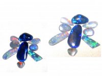
Still playing with some of my "old" opals. I made a fun bug") --thought it might be amusing to share.
--thought it might be amusing to share.
All of these opals have their problems. The best ones are probably the larger black ones that have bands of rolling blue and green fire(top), or rolling blue/purple fire across the stone. The very bright (lower "wing") elongated opal on the lower right hand side has some of the brightest least directional fire that I have ever seen. It really might be a "five" on the Downing scale--but it also has visibale clay inclusions that are between the fire areas and visible through the clear crystal opal. The others have nice fire from some directions but are highly directional, so most orientations show little or no fire.
I also show a brightness/contrast enhanced photo (top photos) to illustrate what the fire might look like in these opals in their optimum position, which in reality is not possible at all times. This also shows how deceptive photographs of opals can be with just a little "massaging", which we did not do in the other photos. The other photos were, however, taken under a bright light source, which also matters when photographing opals.
--thought it might be amusing to share. All of these opals have their problems. The best ones are probably the larger black ones that have bands of rolling blue and green fire(top), or rolling blue/purple fire across the stone. The very bright (lower "wing") elongated opal on the lower right hand side has some of the brightest least directional fire that I have ever seen. It really might be a "five" on the Downing scale--but it also has visibale clay inclusions that are between the fire areas and visible through the clear crystal opal. The others have nice fire from some directions but are highly directional, so most orientations show little or no fire.
I also show a brightness/contrast enhanced photo (top photos) to illustrate what the fire might look like in these opals in their optimum position, which in reality is not possible at all times. This also shows how deceptive photographs of opals can be with just a little "massaging", which we did not do in the other photos. The other photos were, however, taken under a bright light source, which also matters when photographing opals.
Attachments
Oh, those are very interesting! It is good to know who our opal resident expert is! Would you please explain the Downing scale? I have not heard of it before---I have a few inexpensive boulder opal beads and pendants which I find fascinating---------
claudenancy
New Member
- Joined
- Jul 2, 2008
- Messages
- 246
Yes Pattye--I would be glad to give a reference and a brief definition. The brightness of fire scale was developed and is fully described (takes a chapter!) in his book, Opal Identification and Value (Paul B. Downing, 2003 for revised edition). The scale of brightness is just one of the scales that he uses to evaluate an opal. It is a rather complex system, for example, brightness of fire is rather different from saturation of fire color, which is different from fire color, per se. He does go to great lengths to try to operationally define the dimensions and the scale points, but it still requires so experience and practice with actual opals.
The brightness of fire scale is judged under standard conditions using a grading lamp. The scale ranges from 1 (really dull under ideal light) to 5 (so bright that the fire is almost like a flashlight). He says that most people, even those with some opal experience, have probably never actually seen a 5, so one can only speculate what a five actually looks like. 4 is exceptional, 4.5 is really exceptional, and 3.5 is a very good opal in terms of fire brightness.
Other criteria, such as directionality of the fire, must be considered and are not totally independent of brightness (which may be downgraded if the bright fire is very directional). However, there is an independent rating of directionality in his system.
Well, I do tend to be "long winded" so brief was not so brief. If you are interested in opals the book is worth having.
Peace, Beth
SteveM
Well-known member
- Joined
- Jan 29, 2007
- Messages
- 2,117
Sounds like pearldom's ever-elusive 'orient' and 'water.'?most people, even those with some opal experience, have probably never actually seen a 5, so one can only speculate what a five actually looks like.
Opal/ammolite analogies, from geological origin to gem grading, continue to fascinate.
claudenancy
New Member
- Joined
- Jul 2, 2008
- Messages
- 246
Opals can be both fascinating and a bit frustrating. I think that is true with ammolite as well. Do you know if either definitive books or detailed coverage in chapters in general books on gems have been written on ammolites?
claudenancy
New Member
- Joined
- Jul 2, 2008
- Messages
- 246
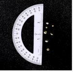
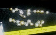
We finally are close to a final design. After I discuss it with the designer/goldsmith who will make the piece, which will include the opal,bezel set, with a turning mechanism in a reflective dish, I will post a preliminary sketch. A quick question. In the current rendering, the designer has suggested the use of very small pearls as accents in the design. He has what he describes as " natural saltwater rice pearls" that he would like to use. I have some very pretty small SS keshis. Of course I would love to use small natural pearls, but do not have any to use and do not know exactly what his are like. Here we are talking about VERY small pearls. Any thoughts? I will post some not very good photos of the keshis that I have. THanks for any suggestions.
Attachments
SteveM
Well-known member
- Joined
- Jan 29, 2007
- Messages
- 2,117
My thoughts immediately went to natural freeform paua (abalone) pearls for something truly original. Rob Wright at Moana Pearls in Oakura, NZ offers jewelers' diamond packs in a range of colors. Contact NZ Natural Pearls via PM or EMail. Here's the link to a post from my memorable visit to their studio.Here we are talking about VERY small pearls. Any thoughts? I will post some not very good photos of the keshis that I have. THanks for any suggestions.
claudenancy
New Member
- Joined
- Jul 2, 2008
- Messages
- 246
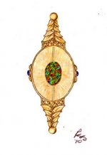
Hi Steve: Yes--I had thought about those too. These would have to be very small--maybe even two mm or less--could even be buttons. I do not know if such small ones would even be available. I will post a drawing of the design below. The pearls would be used as the small beads or "berries" shown in the drawings.
The lattice and the pattern of the leaves were designed to reference the pattern on the back of the stone, which is the brightest part of the stone, and has an almost lattice pattern of darker lines separating color segments. The unsegmented front of the stone is shown in the drawing. However previous posts in this thread show the more segmented back--since the stone will be set to rotate and the dish will reflect the side that is turned to the back, both sides will "show"
The master goldsmith who is making this is Scott Schreiber:
http://www.flickr.com/people/two_claws_jewelry/
Attachments
SteveM
Well-known member
- Joined
- Jan 29, 2007
- Messages
- 2,117
That's a very special piece, your adrenaline must be flowing.
If you scrolled to the prior post to my link above you saw the array of small pieces the Wrights collect with each harvest. As Rob is also a master goldsmith and will appreciate your design, I think if you contacted him he would come up with just the right selection. Consider that paua come in a rainbow of colors, including silver.
If you scrolled to the prior post to my link above you saw the array of small pieces the Wrights collect with each harvest. As Rob is also a master goldsmith and will appreciate your design, I think if you contacted him he would come up with just the right selection. Consider that paua come in a rainbow of colors, including silver.
Bodecia
Pearl Designer & Collector
That looks like a very beautiful opal. Most opal online is rubbish. But yours is special and true Black Opal which as you know, but not all on the Pearl site may know, is the best you can possibly get.
So much Opal is flogged off these days online as being black opal when it is nothing more than what we call "potch". Rubbish Opal which still can be reasonable beautiful, but only when taken for what it is" and not passed off as Top Grade Opal such as yours.
My advice is to wait until your heart sings to you and you know that the only way you can wear it is such and such a way. Don't rush in and regret.
Beautiful, Dawn
Dawn eBay ID dawncee333
GemGeek
Pearlista
I had pictured in my mind your doing something very smooth and simple with the opal. You surprised me by doing something so ornate. You continue to surprise me and I can't wait to see the finished pendant, which I am sure will be very beautiful.
I agree with Marcus. The colors of abalone pearls would be a better enhancement. The Moana people sell little five carat parcels. They might make up a special one to your requirements.
And I agree with Bodecia - take your time deciding what you want as you'll have a lifetime to enjoy the results.
I agree with Marcus. The colors of abalone pearls would be a better enhancement. The Moana people sell little five carat parcels. They might make up a special one to your requirements.
And I agree with Bodecia - take your time deciding what you want as you'll have a lifetime to enjoy the results.
claudenancy
New Member
- Joined
- Jul 2, 2008
- Messages
- 246
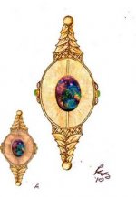
Just for reference: The drawing with an actual photograph of the opal back pasted in place, and one with the "dish" shown as a slightly different shape. It is my understanding that the goldsmith must fabricate the dish to best reflect the opal--so the actual dish may not be to actual proportion in prelim drawings.
Attachments
claudenancy
New Member
- Joined
- Jul 2, 2008
- Messages
- 246
I realized that the colors shown on the opal back are not "true"--the purplish areas are actually a brilliant red to orangy red to yellow fire.
The central design concept --the dish and the mechanism for rotating the opal (which will be bezel set in the reflective dish) and the post attached to the bezel (top and bottom) with knobs that can be turned at the end of the post at the bottom (and possibly at the top near a bail) are pretty much decided upon. I would most appreciate any input (forum or through pm) on the more or less "decorative" elements" of the design, which do serve the function of encasing the somewhat delicate turning post mechanisms, but which can also be modified in detail.
The central design concept --the dish and the mechanism for rotating the opal (which will be bezel set in the reflective dish) and the post attached to the bezel (top and bottom) with knobs that can be turned at the end of the post at the bottom (and possibly at the top near a bail) are pretty much decided upon. I would most appreciate any input (forum or through pm) on the more or less "decorative" elements" of the design, which do serve the function of encasing the somewhat delicate turning post mechanisms, but which can also be modified in detail.
GemGeek
Pearlista
When all is done, we'll need to see a video to really appreciate what it can do. It's definitely growing on me. I particularly like the lattice pattern transition. That opal is incredible.
claudenancy
New Member
- Joined
- Jul 2, 2008
- Messages
- 246
Thanks all! Your comments are all very helpful. The goldsmith and I will be talking as soon as my husband and I return from Peru--leaving Friday--must pack and stop having opal dreams!
Similar threads
- Replies
- 5
- Views
- 2K