Help Appreciated With Evaluating Item

Thanks everyone for the kind words :D

Pattye, that is a great idea. For now I have it on a lower quality black cord, I couldn't wait to wear it around; it showcases the pearl well to me. I think I might want to experiment with twisting a leather cord together with a gold chain or some combination of textures for a fancier look.
The comparisons will have to wait until next weekend~

IMG_20140208_153812.jpg
 
It looks great both ways,on chain or leather! Awesome because you can wear the leather for very casual, and fancier chains for work or going out. I agree with the others, it's even more beautiful in person, nice score :)
 
Rocking the leather jacket, denim, and tahitian pearl! What a nice combo. It is a lovely pearl, and seems to be a true peacock; every angle is lovely. Well done!
 
Thanks everyone for the ever-kind comments, I have been wearing this pendant daily. I'm absolutely obsessed with fashion and style...once I get more time I want to take some nice photographs like Seventh Sphinx! I am in love with her website.
I just need to get my photo-inclined husband on board; hoping my newfound obsessions haven't driven him up the wall already ;) He is taking this somewhat like the way I responded to his RC cars, planes, and quadcopter obsession two years ago (= slightly alarmed but patient).
 
Vendor and Buyer Comparison Shots

Vendor and Buyer Comparison Shots

Hi everyone, I wasn't sure if this should actually be in the Show us your Tahitians thread, or here, but for the sake of continuity I decided to post here first. Let me know if there's a preference for them to be there too.

Posting these photos might be a little redundant in my case (my apologies) since I was lucky- and Druzy Designs is wonderful- that the pearl turned out exactly as I would have expected based on the vendor photos- factoring in the bright conditions of the vendor photos. But since I said I would try to take and share photos of similar angles I am following through with that and uploading these side-by-side with the vendor shots.

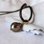
Maybe to others' eyes the pearl might appear more different; so I hope the pictures are helpful. These were taken with Canon S95 on Auto setting under indirect sunlight, a little dark at times. No adjustments were made except to crop the images. In direct sunlight, the pearl is a uniform gunmetal gray with the slightest hint of color.

In some cases I didn't get the exact face of the pearl but the roundness of the lower half pretty much makes the colors similar all-around. I think that there are a few shots that show the "blemishes" with a little more clarity- BUT I am absolutely not suggesting that these are bad flaws, hence the quotations- as you all know I have been gushing over this item for the longest time (sorry folks!).

The summary of description from the vendor was spot-on: 10.2mm x 12.6mm, "black w/rainbow peacock overglow", "minor natural blemishes", "near-round" with "high mirror metallic luster"

Photos are as follows, with Druzy Designs' on the left and mine on the right:

a v.jpg Kamoka Dark Peackock Studs

b v.jpg b b.jpg

c v.jpg c b.jpg

d v.jpg d b.jpg

e v.jpg e b.jpg

f v.jpg f b.jpg
 
Khanzy,

Kudos to you for taking the time to take all these excellent photos and then post them (2 separate time-consuming jobs.) I think these sorts of side by side photos are really helpful to pearl buyers.

The various vendors' glamour shots are great eye candy -- who doesn't love those photos?-- but when one is buying, one wants to have a realistic idea of what to expect.

Your pearl is lovely, by the way!

Now here is a question for you-- do your photos show the colors as your eye sees them? I found when photographing my Tahitian pendants (and other loose Tahitian pearls I have not done anything with yet) that my eye saw more color than my camera could capture.
 
Khanzy,

Thank you for the photos! I'm wondering if you photographed the pearl against white cloth, but the color is showing up gray. I am finding I often need to adjust the exposure to brighten my photos to represent the true colors better. Sigh, I think there is something called "white balance" I need to read about in my camera manual.

I love that pearl!
 
Pattye, I often find that white backgrounds come out that sort of bluish gray color in my photos. I haven't been able to eliminate it with camera settings, so I adjust for it in iPhoto by editing the color of the photo as necessary. Correcting the background corrects the pearl color as well.

I tried this with that first photo of khanzy's and this was the result-- khanzy, is this what the pearl looks like to you?
 

Attachments

  • khanzy's photo.jpg
    khanzy's photo.jpg
    25.2 KB · Views: 26
Thank you, Pearl Dreams, I think that at least in the conditions I was taking them under the pearls themselves looked quite close to how they photographed.

Good point Pattye, now that I look at them I think my photos were a bit too cool toned compared to reality; the white balance was definitely off kilter using the auto function (I need to review photography 101 on a DSLR). Maybe I should put them all through Lightroom and repost? To be more accurate, the cloth propping the pearl in the top right photo is light gray, while the cloth below is true white. To my eye at least the large difference in the background isn't representative of the magnitude of difference in the pearl itself.

It is so interesting to figure out the particulars about how to accurately represent pearls in photography! I should revisit that thread about taking pictures of pearls. Especially given all the different conditions people will be wearing them in (not to mention the degree of variation in monitors and visual processing of colors in the mind). Much respect to the retailers that have to grapple with this dilemma every day.

Here is an example of a quick adjustment I made on the temperature and exposure, I found it pretty difficult to match the white of the shirt in the photo to how I perceive it in real life. It still looks a little blue to me; I guess "neutral" is hard to come by in real life.. With more practice hopefully that can improve!

IMG_2604.jpg
 
Pearl Dreams, thank you for taking a shot at this :) I think that is actually a bit too warm/cherry compared to what I am looking at right now. The violet color is more blue-toned than red. Maybe I have to readjust my monitor's color display....
 
Back
Top