what color background to display pearls

cc811

Member
Joined
Nov 5, 2014
Messages
6
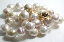
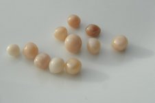
I have a question in regards to what color background is optimal in displaying pearls? Especially in a retail, do you present the pearls on a white cloth or black cloth?

While i worked in jewelery retail, i was taught to always show the pearls on white cloth to the customer as it brings out the true color of the pearls the best. However recently i heard the opposite, that black makes the pearls stand out and white washes out the pearls, making them less appealing.

If any of the professional pearl merchants like to share their view on this, that would be great! Thanks
 
I'm not a professional pearl merchant but just from putting various pearls of mine on different color backgrounds it's very clear to me that they look best against a white background, fwiw!
 
Great question!

We normally show pearls on white background. It's a combination of showing the product best overall vs. total online experience.

Having said that, some of our partners show them on gray/shaded backgrounds, and it has not hurt their performance.

I think in the end it's the quality of the photography that matters most... e.g. a lousy picture on white is worse than a great picture on black... a 20 megapixel image vs. a 12 megapizel image is better... regardless of the background. Right now reshooting a lot of product at higher resolutions/sizes is a priority for us. I'm confident that doing so - regardless of background - will result in better "reality" based imagery/shopping experience for the customer.

FWIW, my own personal preference is black, or dark red... e.g. darker is better. I think it provides best contrast and shows off pearls to best advantage. But given that I see pearls shown overwhelmingly on white background, I have to say my personal preference does not seem to predominate...
 
White is usually best, although the right shade of grey can really bring out overtones and body color. The only rule here is NO BLACK! Black has a magic ability to kill luster and kill all overtones. Sure they will contrast more with the black background, but I don't think you're doing the pearls any favors using it.


Good points about photography Kris, quality matters. It's important to take your time and do them right, it's the most important part when trying to sell jewelry online.

I've seen some vendors go so far as to use computer generated graphics of pearls, instead of actually photographing their pearls. While you get to control every aspect of the "photo", a little too sneaky for my tastes, even if the average person doesn't spot it.
 
Technically I'd have to say I'm a professional, lol, but struggle with taking photos. Prefer white (soft white) or light gray, as they don't distort luster and overtones. I have a small inexpensive bust in a beige linen type fabric, which is just ok. When I worked retail (Nordstrom Fine Jewelry) we used pale gray displays and pads. When peeps request evaluations of their pearls shown on a black background, we always recommend rephotographing on a white paper towel. It makes a huge difference!

Are you thinking more for photographic purposes, or for shows and bazaars?
 
That blue silk and white pearls photo screams luxury ... very beautiful :)
 
White is the best, macro camera is important , sun shine make waw
 
I have to ask, because I'm curious: why are pearls packaged in black velvet-lined boxes, since the first view the customer gets of their new pearls is so unflattering, and the velvet leaves black fuzz on the pearls?

I have received a few pearls in white boxes; are they just not available any more?
Or do the white ones cost more?
 
White doesn't cost more, it's just really difficult to keep clean. The boxes have to be dismantled to be hot stamped and any sort of mark or particle shows up and is difficult to clean from velvet lining.
 
image.jpgI've seen only one magnificent photo of pearls on a black background; a very close-up photo of two strands crossing each other. Jeremy took it. I think it was in a batch of photos taken in the hallway of his building, in natural daylight. I'll search for it.

(I was wrong about the photo circumstances, but found it anyway. ok to post it? Attribution to Jeremy or PP photographer, or ?)

(not that I've seen every pearls-on-black-background photo)
 
Last edited:
Excellent question cc811, I have spent so many hours trying to photograph pearls well. I have occationally photographed white pearls against a black background and made them look good, but it works so much better against white.
10mm round white necklace clump.jpg
 
Well, Pshwar! Nice, Isis! I'll be thrilled if this thread brings on a rash of gorgeous white-pearls-on-black photos...
 
Thank you lisa c. always happy to oblige.

For size reference, the clasp on the strand below is 10mm.

kasumi curled.JPG

For similar pearls against a white background:

kasumiwhitegoldneckgall.jpg

again the clasp is 10mm!
 

Attachments

  • kasumiwhitegoldneckclump.jpg
    kasumiwhitegoldneckclump.jpg
    67.3 KB · Views: 65
Like Isis, I prefer shiny white too. It brings light to the undersides of the pearls. The shadows add nice contrasts to the composition.
 

Attachments

  • storm_pearls2.jpg
    storm_pearls2.jpg
    19.6 KB · Views: 71
On my screen that looks quite grey Dave. Is that a stark white? Lovely pearls :)

I use a pure white porcelain plate and a single light source. I also have a light box that's back lit to give the appearance of a white background, but uniform light tends to cancel out stray light, removing irridescence. Pearls look nicer with glints and subtle shadows.

And thank you :)
 
image.jpgI Definitely prefer white backgrounds for realism and flattering pearls.

For artsy though, fantastically enlarge the pearls on a shiny black background and you've got WOW!

(I sheepishly admit to blowing up each photo you guys post until the pearls fill my screen. Then I fall into them.
Mostly though, a black background drains the colors right out of a pearl photo).
 
Last edited:
Back
Top